
Beat.box Case Study
Designed and written for my Visual Design course at General Assembly
Role
Visual/UI Designer
Tools
Figma, Adobe Photoshop
Skills
User Research, Visual Design, Brand Identity
Timeline
September 2020 - October 2020
Objectives
Launch Beat.box as a new music streaming service by having potential users visiting the mobile homepage and download the app.
Give users the opportunity to discover new music from emerging and established musicians in an unexpected way through playlists offered, which are not generated through social rankings, critical reviews, or the user’s music library to create music recommendations
Background
Beat.box is a new service that offers curated playlists unique to each users. The playlists will be generated after each user answer the questionnaire provided when they create an account, which will align with users’ interests, tastes, likes and cultural touch-points.

Target Audience
Beat.box’s overall demographic profile are men and women from age 18 to 35.
Primary audience are men and women from age 18-25 who are socially-active and loves to discover new music to share with friends. They enjoy exploration and discovery, and love to be the first in their peer group to be in-the-know about new music.
Secondary Audience are men and women from age 25-35. They are looking for a novel and quick way to create a new playlist, they are open to being educated about new musical genres and emerging musicians.
Competitor Analysis
Most platforms are offering general playlists that are available/accessible to every users at the moment: they are generated either based on mood users are looking for, or by social ranking. Only Spotify at this moment offers “Discovery weekly” playlist that is tailor made for users. However, that playlist is generated based on users’ listening history. 8tracks and Pandora allow users to discover new artist with a higher frequencies based on the nature of their playlist focused feature
Beat.box has a lot of opportunities in offering tailor made playlist for each users.

Brand Positioning Map
Outcome

A mobile homepage introducing Beat.box, encouraging account registration and download
Engaging and direct copy writing that explains what Beat.box does
Previews of the app
“Download” CTAs for Apple and Android
“Sign Up” CTA
An easy and straightforward (skippable) questionnaire to engage potential users in answering, which will appear immediately the moment the homepage is loaded
A sign-up form that allows users to create an account without having to answer the questionnaire.
Process
Research: Interview & Keyword Analysis
I interviewed two participants that fit best as Beat.box users (18-35). Mana is 24 and Caner is 33. They both listen to music daily and enjoy live music events.
Key Findings: Both Mana and Caner see music as an extension of themselves. Both have agreed that a playlist is like a journey of self discovery, through a wide range of one emotion to another. They both love discovering completely new songs and artists that they don’t usually listen to. Whenever they listen to music they just want to “sit back and enjoy”- which they need a service that is straightforward to use and can introduce them to new artists.

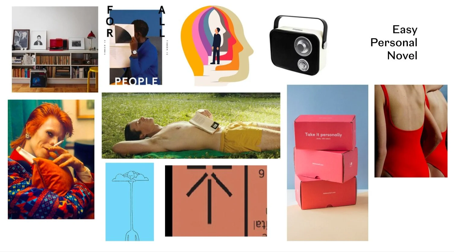
Moodboard
After reviewing the creative brief and the interviews I conducted with two participants, I finalized the keywords that best describe Beat.box are Easy, Personal, and Novel. They represent Beat.Box’s wish to offer an easy to use app, while maintaining its novelty for user through personalized playlists.
Components
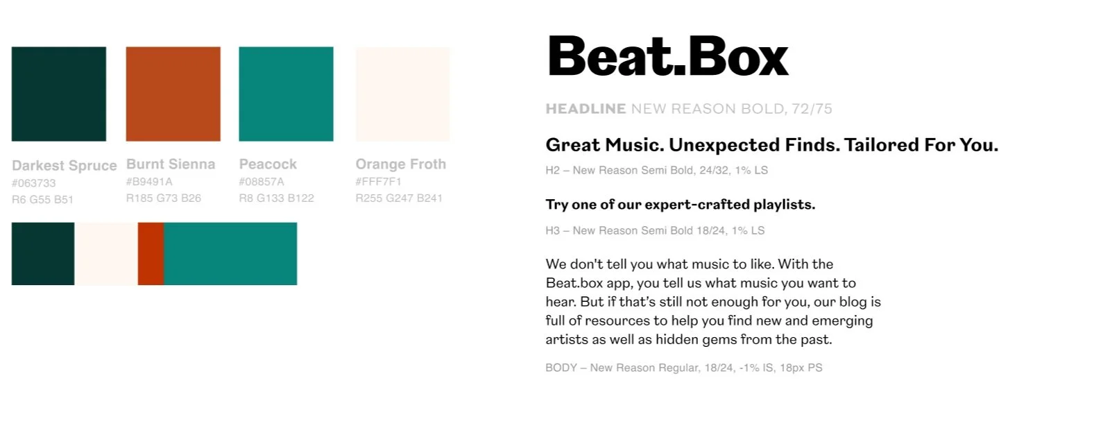
Colors
Inspired by David Bowie- a formidable musician who’s known for blurring genres and expressive styles. The palette includes an optimistic teal Peacock, energetic orange Burnt Sienna. Orange Froth and Darkest Spruce help harmonize the palette together without making it feel uptight and boring.
Typography
New Reason is a typeface that is developed by Miles Newlyn (newlyn.com). The typeface itself is sans-serif, which will bring a modern and practical look for Beat.box. New Reason also has its own quirk with special curvy details in lowercase and some uppercase letters that showcase novel and unexpecting qualities, which align with Beat.box’s direction.
Mobile Landing Page

Usability Testing
Total participants: 3
Age Range: 20-35
Method: In-person testing
Goal:
To receive feedback on how easy and straightforward does this landing page feel for each person (on a scale of 1 to 10), and how likely will each of them download Beat.box and start using the service.
Summary:
All 3 participants have given the score 10/10 on how easy and straightforward the homepage feels. It makes them curious enough to download Beat.box and use it. One participant has pointed out that copywriting needs to be clearer if this is a paid service or not.
“The homepage is streamlined and easy to navigate. I especially like the “Unexpected Finds” previews of the app, makes me want to download it right now and try”. ”
“I’m very willing to answer the questionnaire- seems like Beat.box is something very different on the market right now.”
“I like there’s the little quiz on the homepage too so people can interact and try out how the app works”
Next Steps
User testing for the app will be conducted to receive feedback and further refine it with a developer and a UX designer
The mobile landing page will be translated into desktop and tablet version.
Key Learning
Understanding the target audience and the client’s point of view is very crucial. As a designer, I have the responsibility to understand both thoroughly & find a middle ground with storytelling via design process.