Blck Hare Apothecary Branding
Details
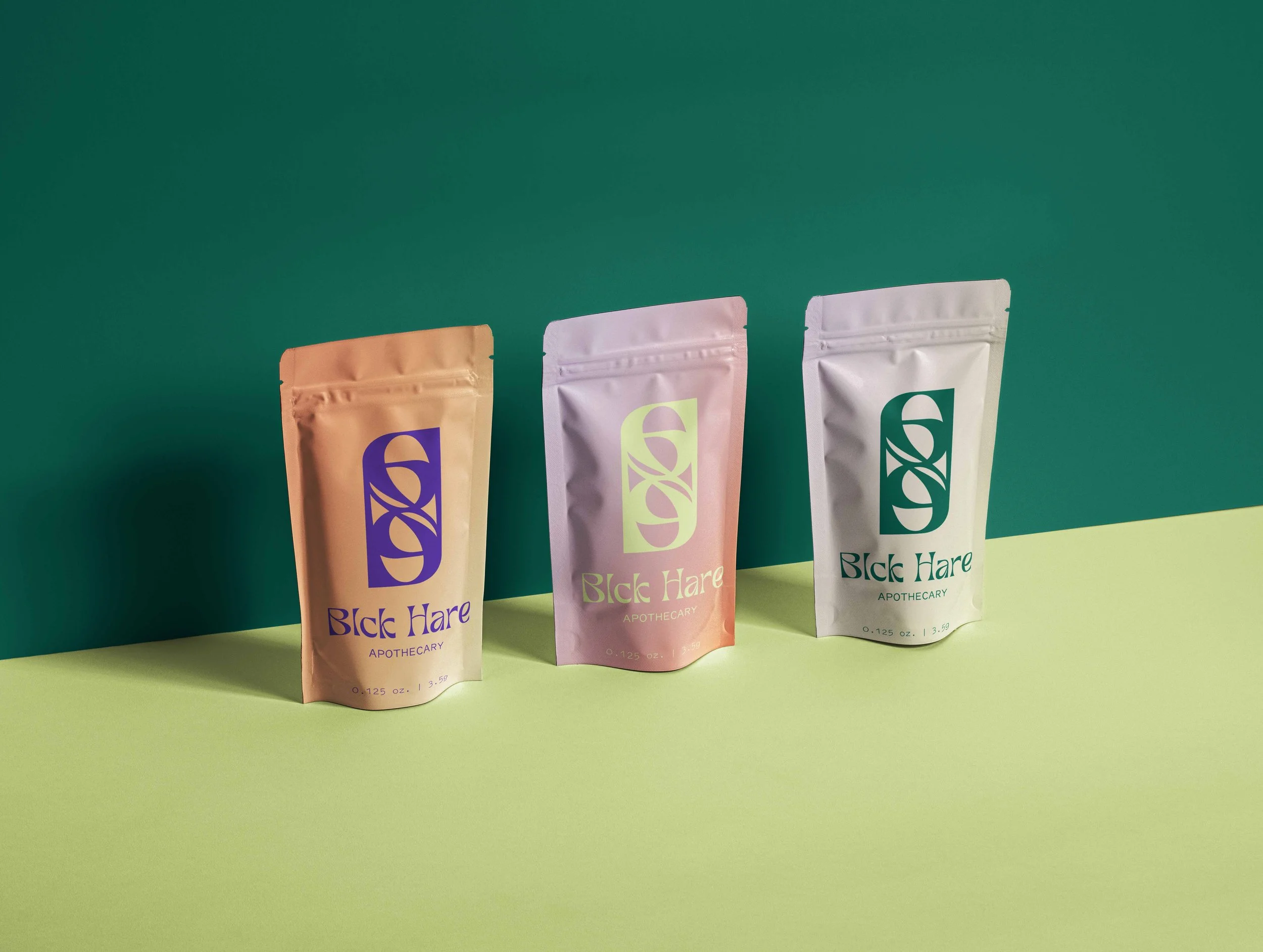
Blck Hare Apothecary is a Black-owned, LGBTQ+ cannabis business based in Brooklyn, New York. The brand aims to create an inclusive and playful experience when buying cannabis products.
This project aims to translate what Blck Hare Apothecary stands for into visual language, via the logo, typography and color palette. Inspired by Alice in Wonderland, color palette and typography choices bring a whimsical feel while the logo adds elegance to the overall branding.
Tools
Adobe Illustrator, Adobe Photoshop
Skill
Art Direction, Logo Design, Visual Design
Timeline
October 2021
Typography & Color Palette
The color palettes evokes a whimsical feeling with the lime and lilac pastel, which are grounded by their darker versions. Purple is also a significant color to the LGBTQ+ community. A pop of red, with three custom gradients also make the palette more playful.
Tan Paradiso is a gorgeous typeface that brings Art Nouveau influence. Thanks to its beautiful curves, further adds elegance to the brand overall look in contrast to the playful color palette.


The Logo
The logo is composed by two letter “B”s from Tan Paradiso typeface, creating a timeless and elegant look. The logo center can be reminiscent of the rabbit hole in Alice in Wonderland due to the spiral look.

Branding Applications
With all the components together, they create a playful yet refined look, further creating an inclusive and safe environment to purchase cannabis product for everyone .


